

Summit Cold Brew
A ready-to-drink coffee with no name, no can and a shelf date eleven weeks out. Built to be recognised from two metres away, in a fridge full of competitors.
- Client
- Year
- Scope
- Live site
- Visit
The problem
Ready-to-drink coffee is a category where every can is beige, every can says “smooth”, and the customer decides in about a second and a half through fridge glass. Summit had a genuinely better product and eleven weeks before their first retail slot.
The constraint set the whole brief: whatever we made had to survive being seen small, cold, at an angle, and next to nine other cans.
What we did
- Named it. Twelve candidates, cleared for trademark, tested by being said out loud in a noisy room. “Summit” won because it survived that.
- Designed for the fridge, not the render. We printed proofs, put them behind glass at two metres and threw out the two everyone had preferred on screen.
- Made the flavour system colour-blind safe. Variants are told apart by a ridge motif and can position, not hue alone.
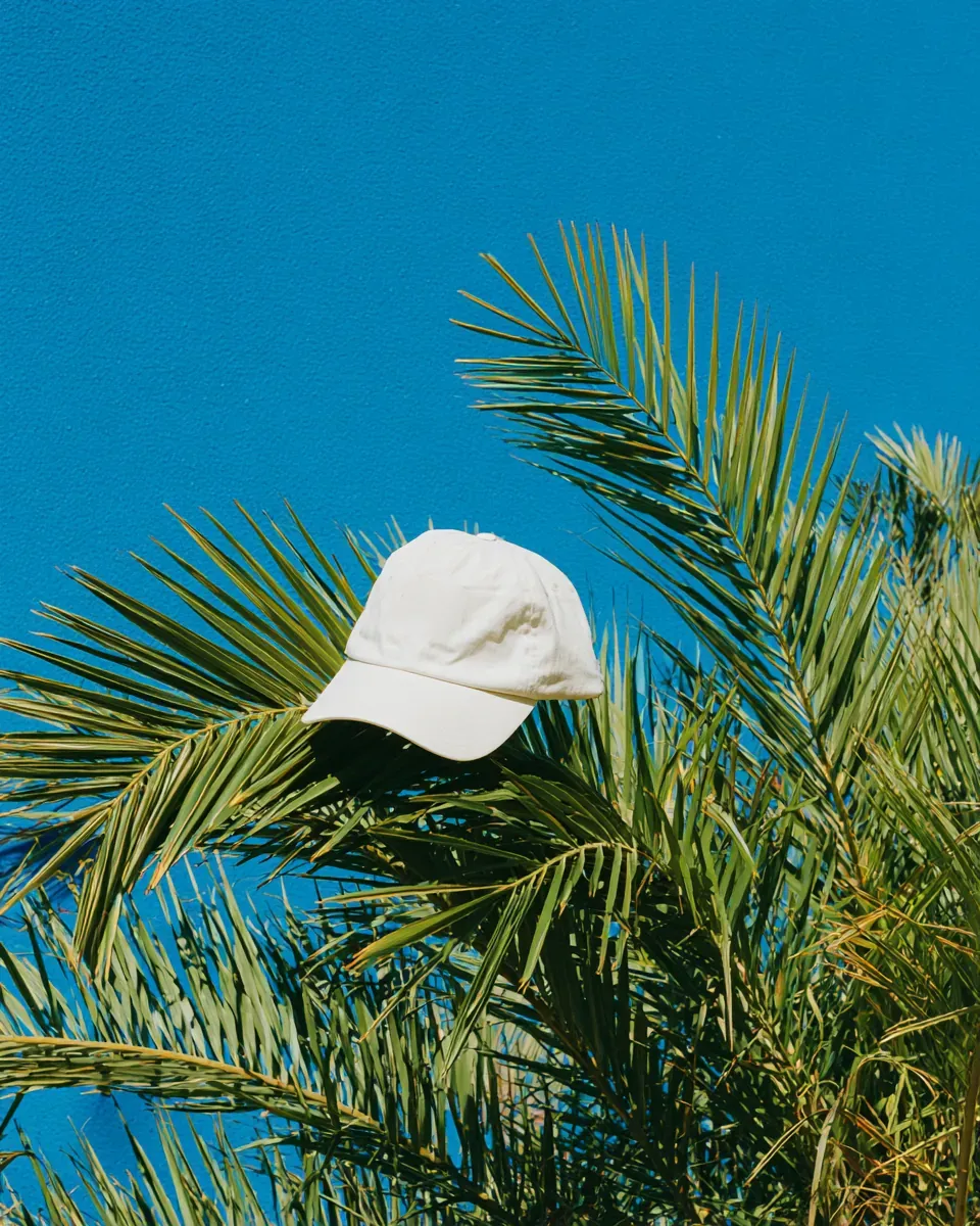
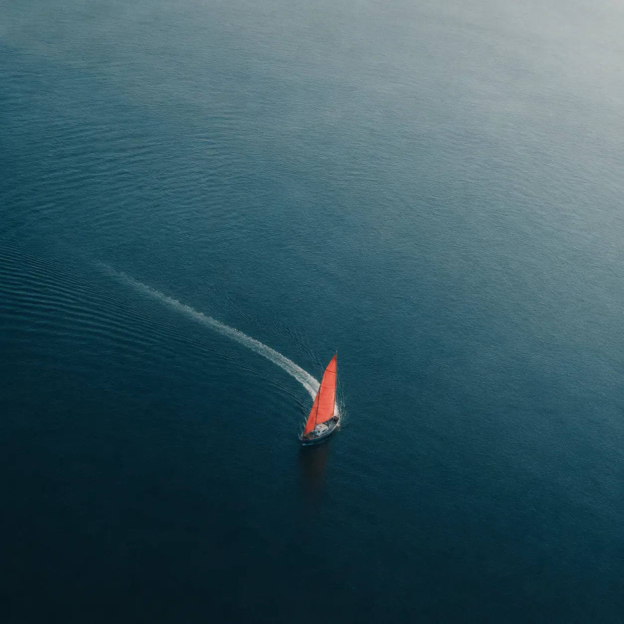
- Art directed the launch photography as a fixed set of rules — how the can is lit, what it is never shot on, and how far the horizon sits.
- Wrote the label copy to the FDA constraints from the first draft, so nothing had to be redesigned around a legal note at proof stage.
The best-looking can we made was the third-most legible. It didn’t ship.
Outcome
- Three SKUs on shelf in eleven weeks, from an empty brief.
- Distinct at two metres in blind fridge tests against nine competitors.
- The art direction rules were handed over and are still what their in-house team shoots to.