


Oura Botanics
A skincare line with real formulation credentials in a category built on vague ones. The identity had to prove something the packaging usually only implies.
- Client
- Year
- Scope
- Live site
- Visit
The problem
Oura’s founder is a cosmetic chemist, and their formulations were genuinely more rigorous than most of the shelf. None of that was visible. Their packaging looked like every other beige-and-serif botanical brand, which meant it looked like the ones making things up.
Sounding natural was not the goal. Sounding accountable was.
What we did
- Put the numbers on the front. Actual concentrations, set in the same size as the product name. Nobody in the category was doing it, because most of them can’t.
- Dropped the botanical clichés — no watercolour leaves, no hand-drawn script. A plain grotesque and a lot of white space read as laboratory, not apothecary.
- Designed the ingredient page as a real page, not an accordion at the bottom. It became the second-most visited page on the site.
- Built the storefront around one decision at a time: skin concern first, product second, routine third.
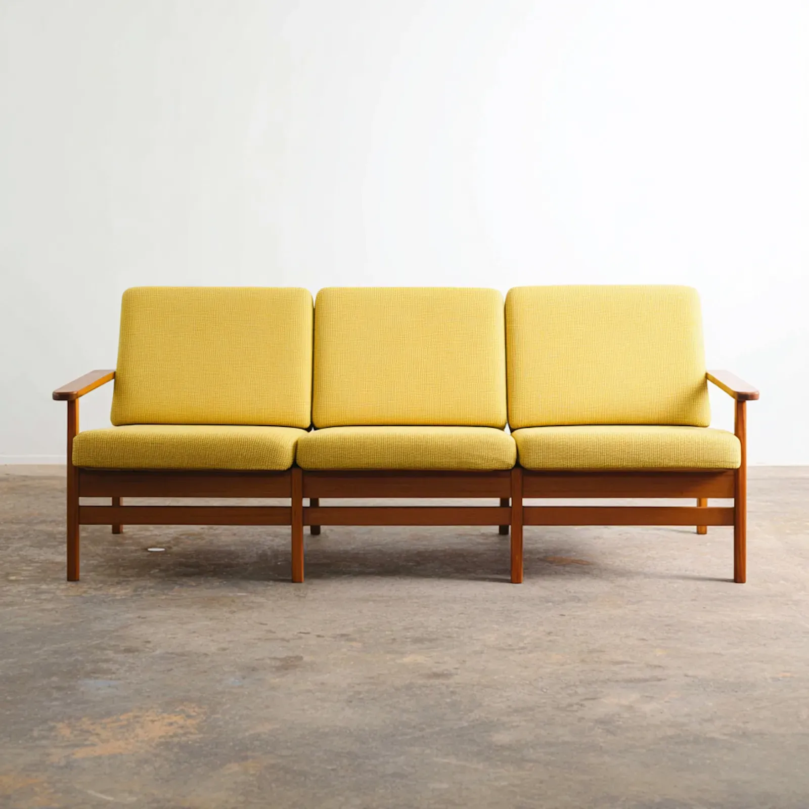
- Set the photography rules — product on flat ground, one light, no models. Cheap to reshoot, which matters for a brand launching four SKUs a year.
In a category where everyone claims to be transparent, the only way to say it is to publish the number.
Outcome
- First production run sold through in five weeks.
- The ingredient page ranks second in site traffic, ahead of the homepage on mobile.
- Return rate settled at roughly half the category benchmark — the packaging sets the expectation the product then meets.